
Brand collaborations
Translating iconic brands into cohesive product collections
Limited-time collaborations are often treated as retail moments.
At their best, they expand brands into new categories, introduce new audiences, and create new design language.
At Target, I helped translate collaborations with Liberty of London, Missoni, and Calypso St. Barth into Home assortments spanning tabletop, textiles, decorative accessories, lighting, and furniture.
My role was to define the design vision, establish guardrails for interpretation, and guide the work across teams and partners until the assortment felt cohesive and true to the brand.
My role
I helped translate high-level brand partnerships into fully realized Home assortments.
This included:
Setting the design vision for Home categories
Creating interpretation frameworks for print, color, materials, and scale
Guiding other design and development teams across categories
Presenting concepts to brand partners and internal leadership
Working with merchants, sourcing, and manufacturers to protect the design intent through development
My approach
Start with the brand
Understand what makes the brand recognizable, loved, and culturally relevant.
Build the framework
Create guardrails for how the brand can translate across Home categories while maintaining cohesion.
Refine through development
Work across teams and manufacturers to push techniques, refine details, and ensure the final assortment feels authentic and cohesive.
It gave the teams room to explore while keeping the work cohesive.
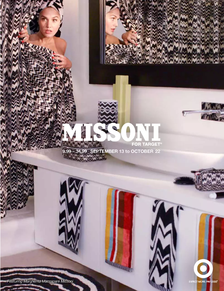
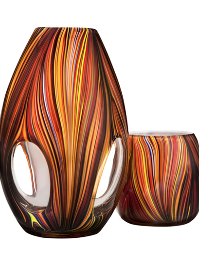
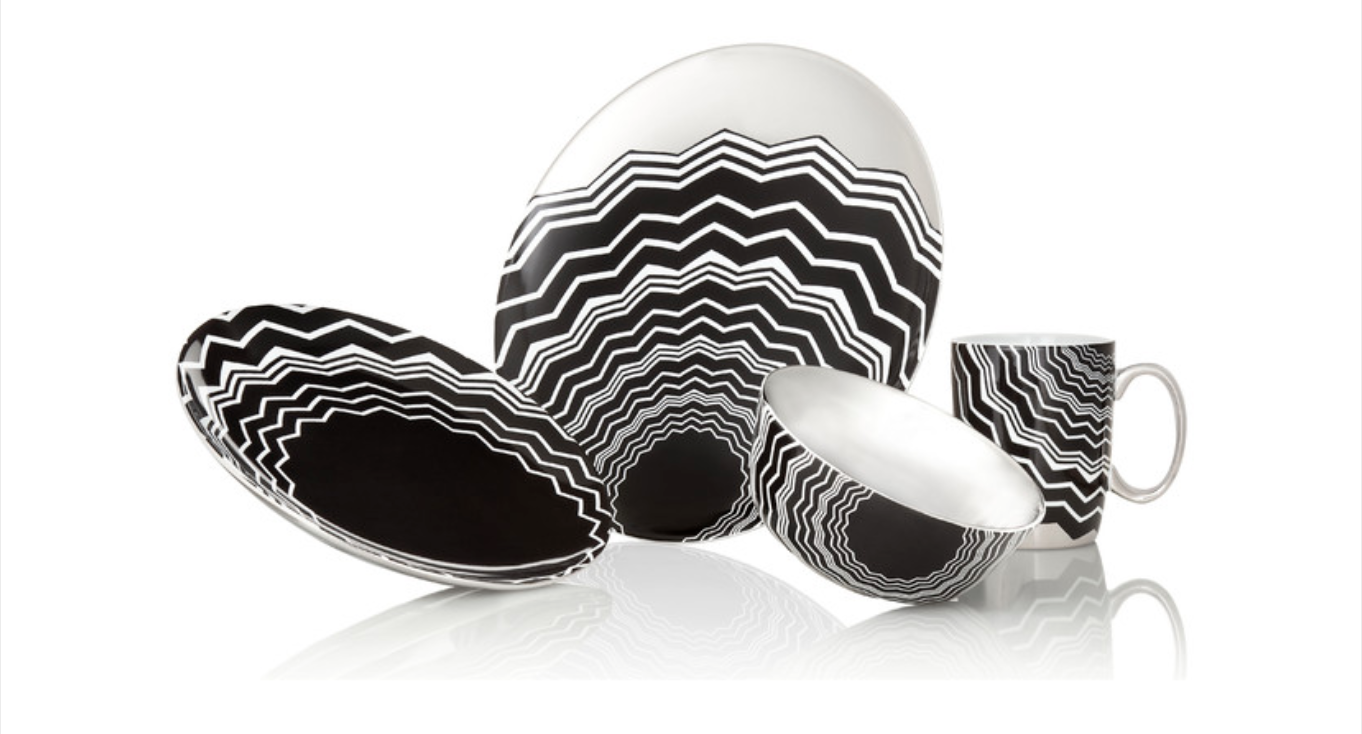
Missoni
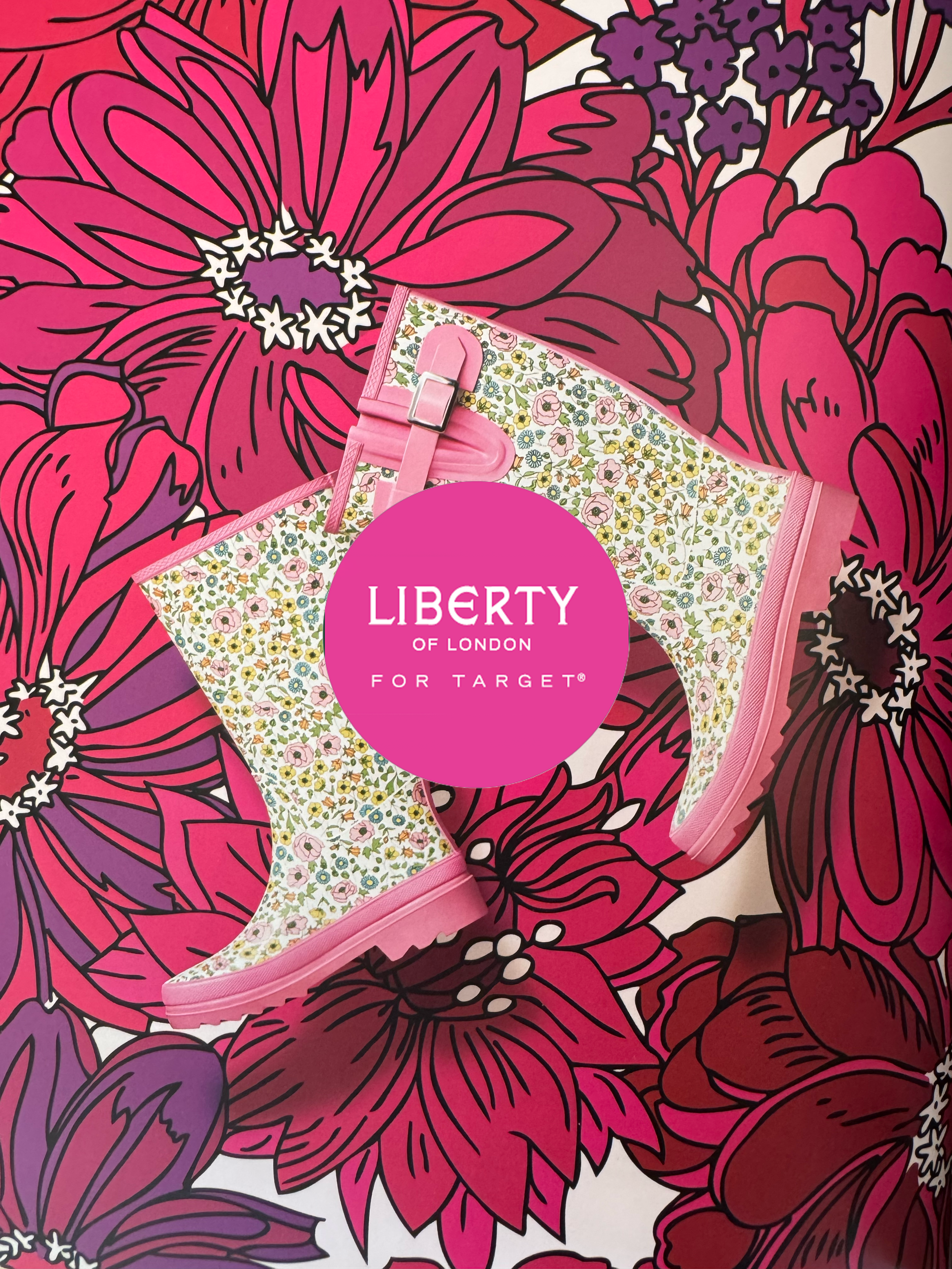
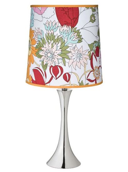
Liberty of London
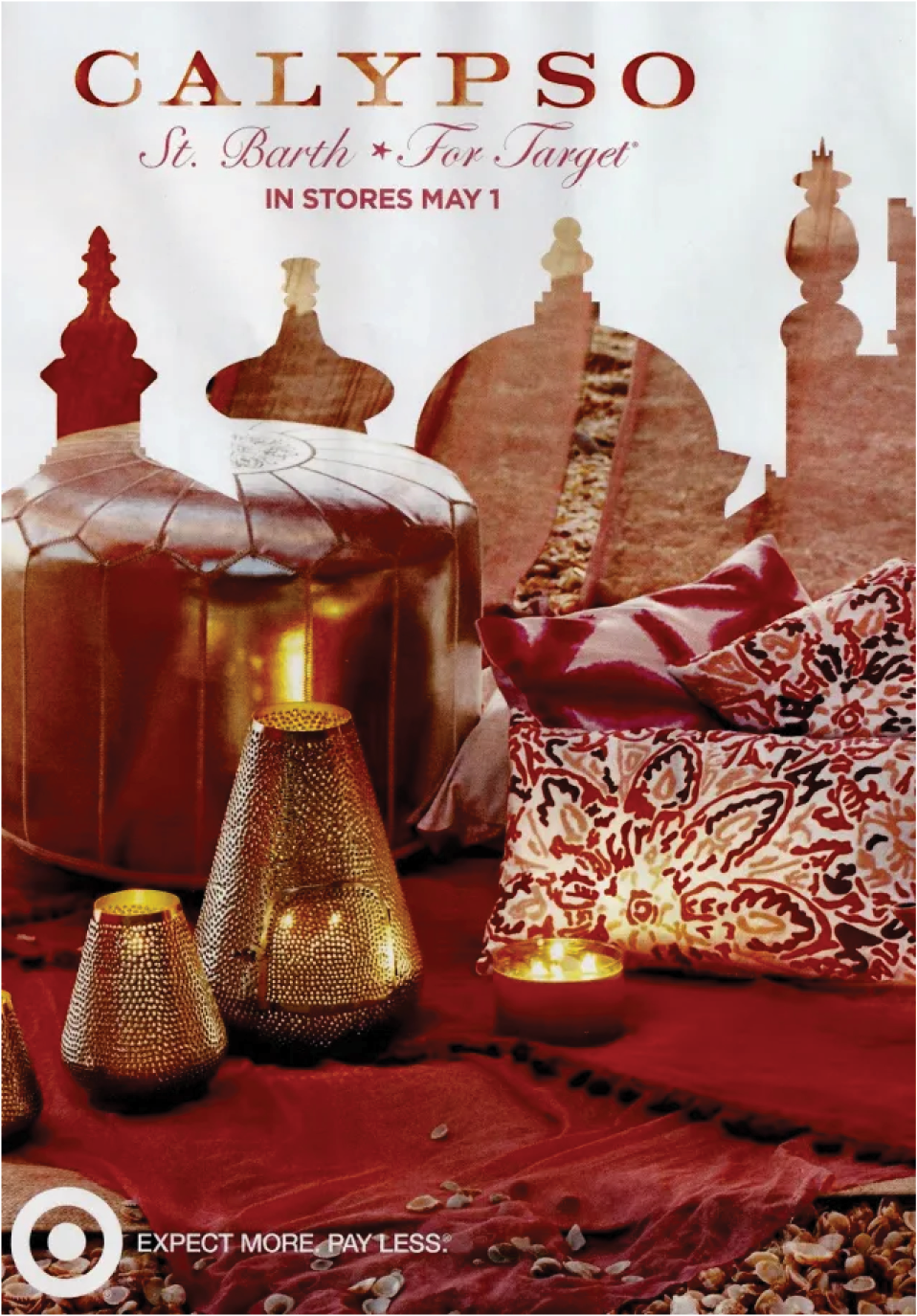
Calypso
St. Barth
This is what that approach looked like in product.
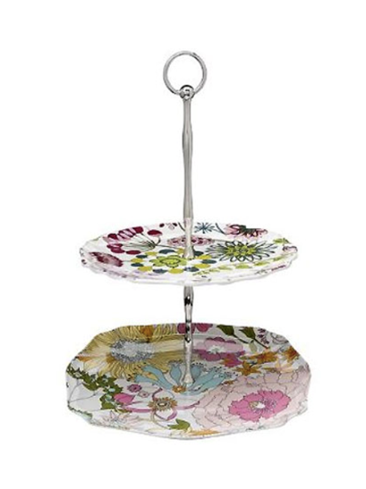
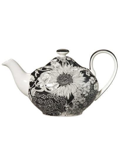
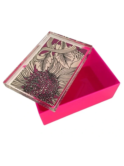
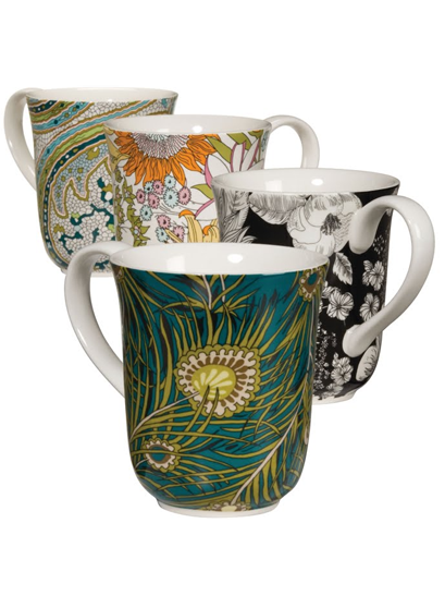
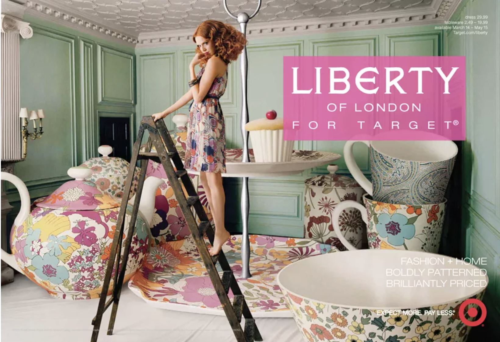
The Opportunity
Bring Liberty’s heritage print language into new Home categories for the Target guest.
The Design Translation
I defined interpretation guidelines for print scale, color palettes, and material application across multiple Home categories.
The Result
A cohesive assortment that maintained Liberty’s historic character while introducing the brand to a broader consumer base.
The Opportunity
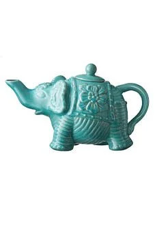
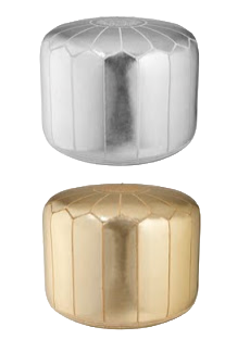
Translate Calypso’s relaxed, resort-inspired aesthetic into a Home assortment.
The Design Translation
I created design guardrails for texture, pattern, and materials so the brand’s bohemian sensibility could translate consistently across categories.
The Result
An assortment that extended Calypso’s lifestyle identity into the Home while remaining approachable for Target’s audience.
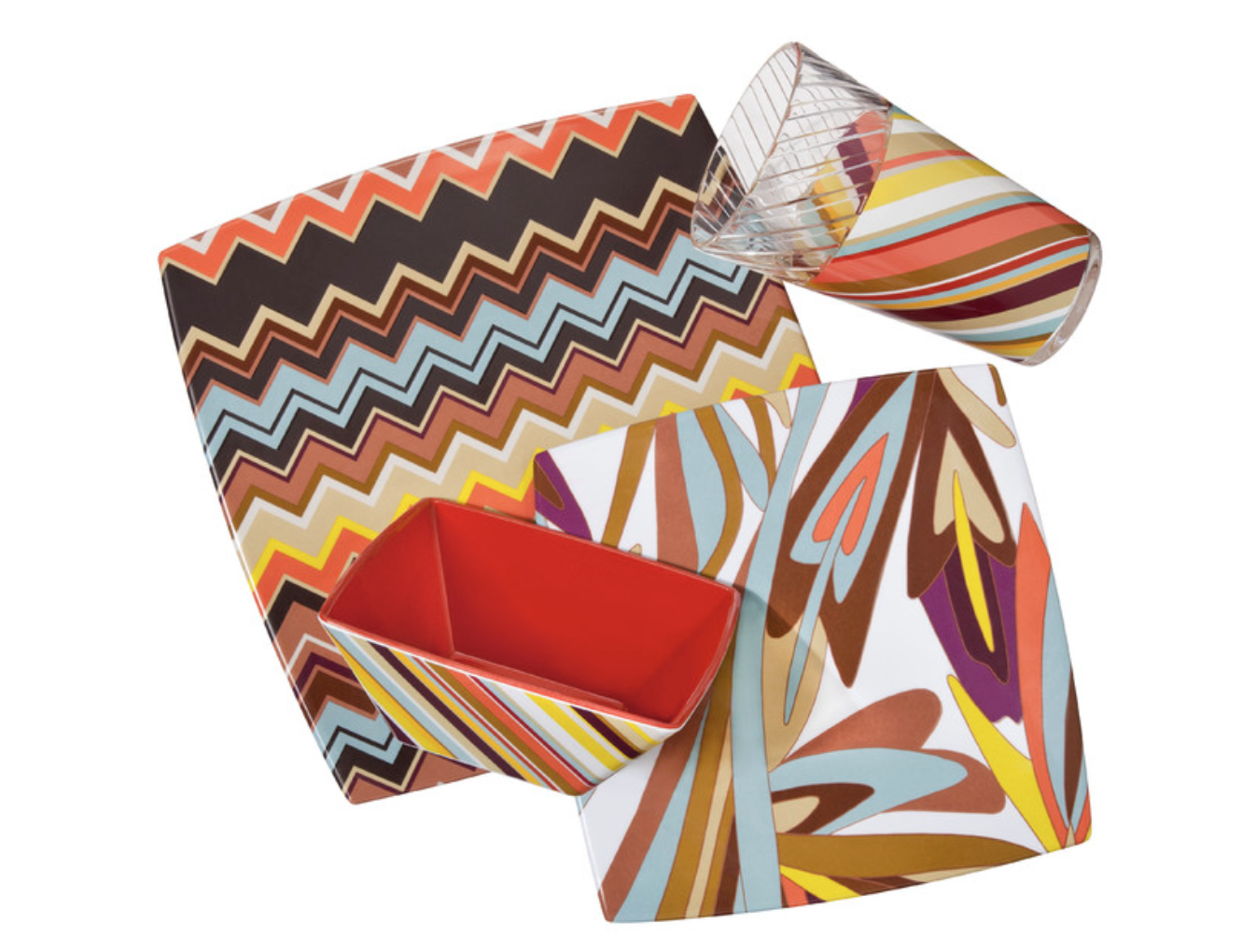
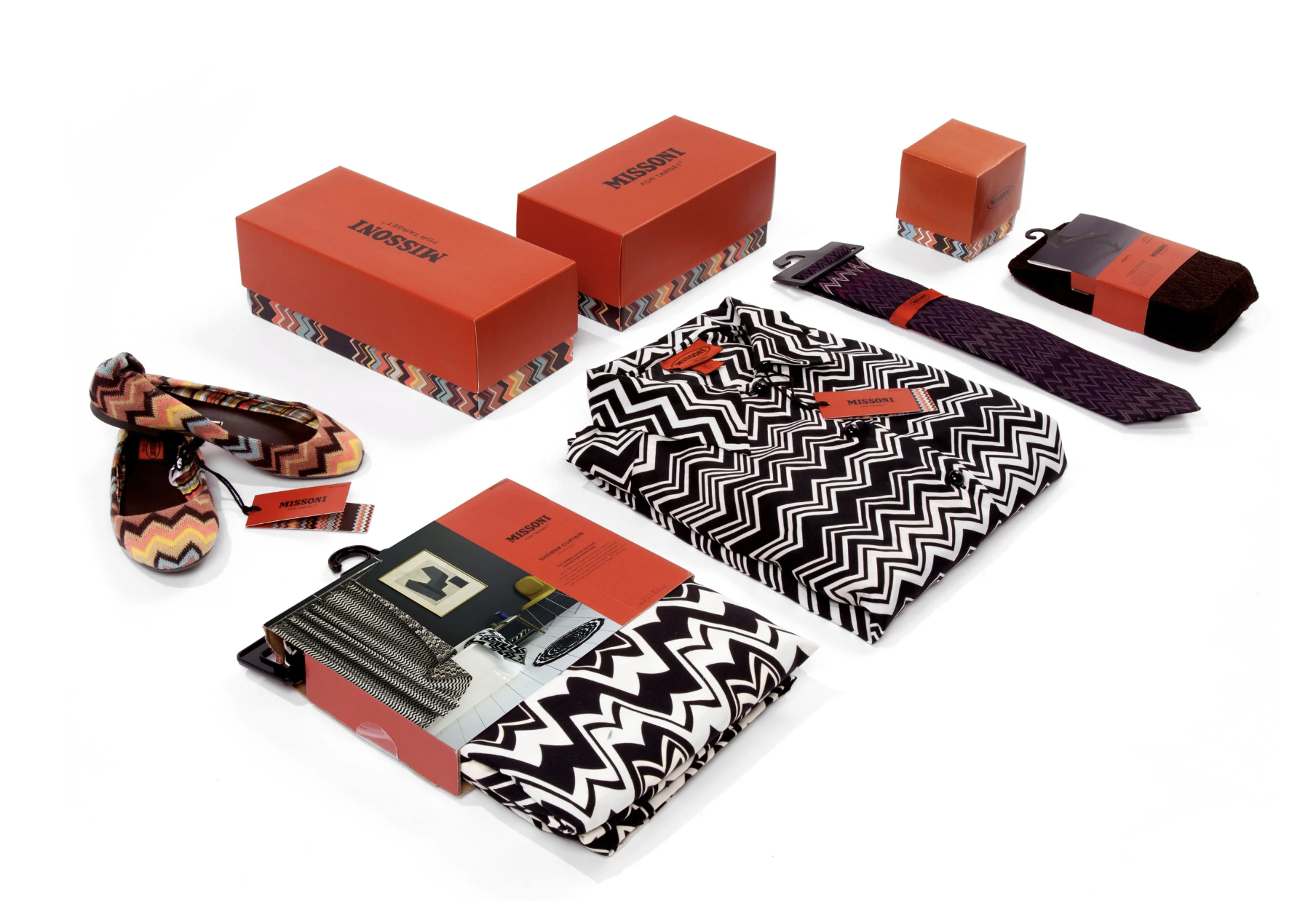
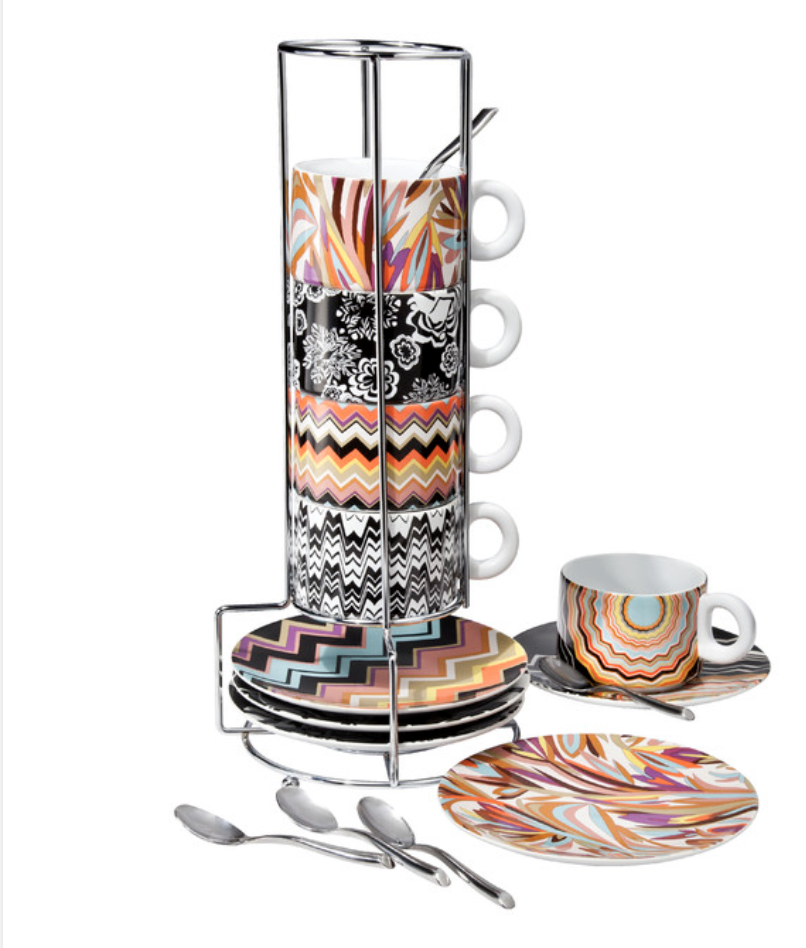
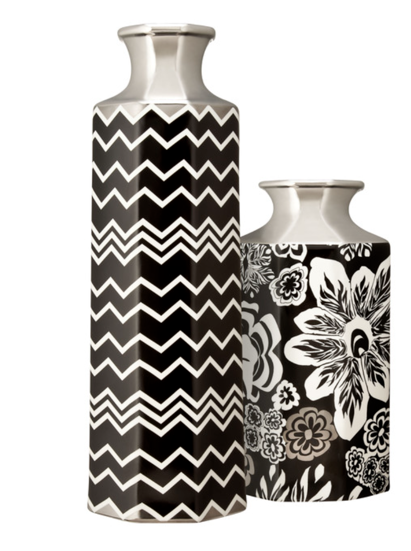
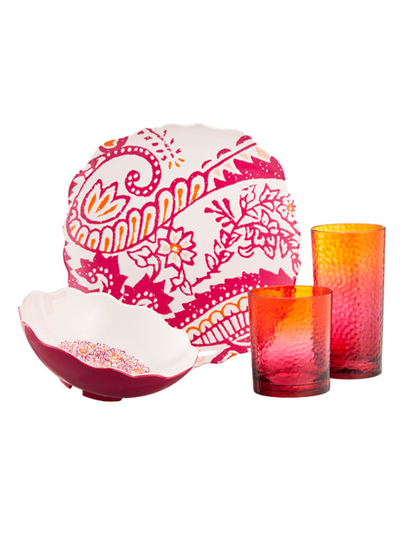
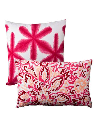
The Opportunity
Translate Missoni’s iconic zig-zag pattern language into a cohesive Home assortment.
The Design Translation
I developed the design framework for how Missoni’s pattern, color rhythm, and scale could move across tabletop, textiles, and decorative accessories while maintaining brand integrity.
The Result
A visually cohesive assortment that preserved Missoni’s unmistakable identity while making it accessible to a wider audience.
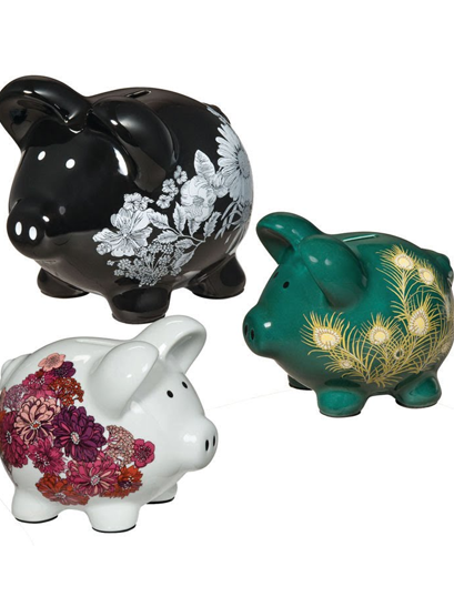
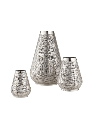
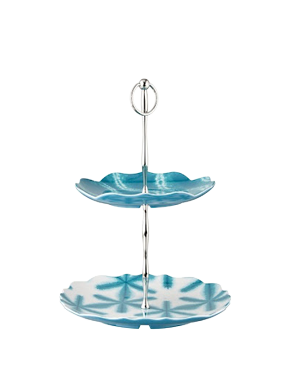
Selected product from these collaborations
LTOs

Up + Up

Goodfellow & Co.

Project Kindred

terraen